Accessible Website Navigation

Accessible website navigation should no longer be thought of as a feature only needed on high-end websites. It should be the standard of every website to allow the same navigational experience for anyone using mouse-alternative devices. Whether that be wands, sticks, switches, sip and puff devices, voice recognition, or eye tracking technology. It’s important to note that not all keyboard or assistive device users are permanently disabled, some are only temporarily injured and some people actually prefer to surf using keyboard navigation.
Creating an accessible website starts here: navigation. Without clear and easy to use navigation the website is essentially useless. Unfortunately using a CMS (Content Management System) template doesn’t ensure that your site is accessibly built as the templates are not always rigorously quality checked for accessibility. For that reason it’s important to educate yourself on at least some basic navigation accessibility techniques.
Skip Links (or ‘Skip Blocks’ or ‘Bypass Blocks’)
Imagine you are unable to use a traditional mouse so you must navigate websites using only a keyboard. Now imagine if every time you went to a new webpage you had to tab through every single main menu item before you could reach the main content of the website. If it was a large site it would be arduous! Wouldn’t it be better if there was a way to go straight to the content?
Well there is! ‘Skip Links’ allows a keyboard or assistive device user the ability to skip repeated sections, (like a main menu) and go directly to the main content. These links are normally hidden in the top left of a website and are revealed when the user starts using keyboard / assistive device navigation.
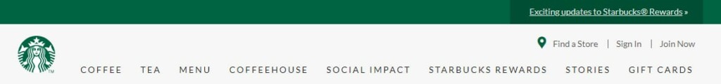
Starbucks.com has designed a nice looking skip links button. In order to access the skip link, load the website, then press the tab key. Once the “skip to…” button appears, the tab key allows the user to choose different areas of the site to skip to – “skip to main navigation” to “skip to Main content” or “skip to footer”. At any time the user can use the “enter” key to invoke that item.


It’s very important to remember to thoroughly test your skip link menu before you launch. There are some bugs/unexpected actions that can appear depending on how your site has been structured.
If it’s interactive, it needs a focus indicator
What is a focus indicator? Put simply, a focus indicator is the part of an accessible website that gives users a visual cue allowing them to easily recognize what item on the website is currently selected. The most common form of a focus indicator is a border around the item.

What should have a focus indicator on it? Any clickable, interactive item must have a focus indicator. For example, buttons, links, form fields, widgets (like a calendar picker), etc.
All browsers have built in focus states, but as the default settings are not visually appealing to some designs, website developers often override the settings. Unfortunately, this also means that they often turn the focus state off entirely.
Removing the focus outline is like removing the wheelchair ramp from a school because it doesn’t fit in with the aesthetic.
David Gilbertson, HackerNoon.com
What makes a good indication of focus? There are a couple of general rules when it comes to these indicators:
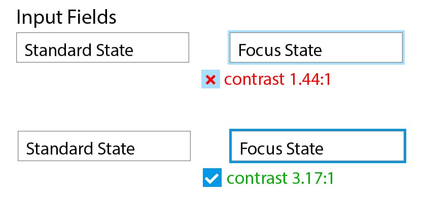
- Ensure your indicator has good contrast, do not rely on colour alone. The example below is hard to see. The WC3 rule states: “If the focus indicator is styled by the author, it must meet the 3:1 contrast ratio.”
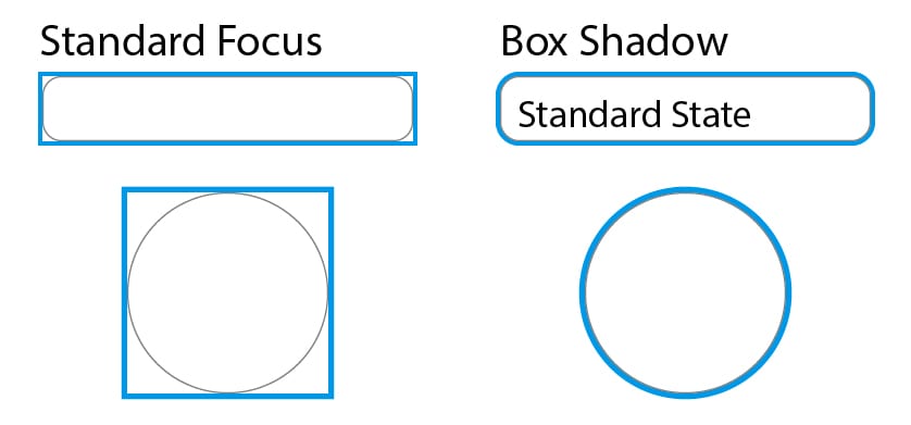
- Ensure that it is a complementary size and shape to the focused item. A standard focus doesn’t have the ability to follow irregular shapes, whereas re-styling your focus to a box shadow allows you to create a more refined look to your state.
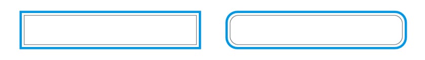
- Offsetting the outline can also be even more helpful to make the state stand out. On a box shadow this can be achieved by using 2 shadows on the focus state.
- Keep the style consistent across all elements and browsers. Planning all your button states during the initial design process will help keep your site consistent and compliant.

- Avoid using the css style outline: 0; on any element that can receive keyboard focus (links, input fields, or any other interactive item).
Navigation Order is Important
It’s a particularly annoying bug when a website’s navigation does not tab forward in logical order. How annoyed are you when you’re tabbing through an order form and the tab function – which should take you to the next input field – goes to a totally unexpected field or element.
I can’t stress how important it is to fully test your website to ensure that your main navigation, your page elements and especially form elements have the ability to be selected in a logical order. During this testing, you may find an item that should receive focus, but is not. You or your developer may need to inspect the code – and you may need to add a tabindex property to the item to ensure that it receives focus.
How do I test my website’s accessibility using a keyboard?
I’m SO GLAD you asked because that means you’re at least thinking about testing! Here is a list of keyboard navigation interactions from WebAim:
| Interaction | Keystrokes | Notes | ||
|---|---|---|---|---|
| Navigate to most elements | • Tab • Shift + Tab – navigate backwards |
• Keyboard focus indicators must be present. • Navigation order should be logical and intuitive. |
||
| Link | Enter | |||
| Button | Enter or Spacebar | Ensure elements with ARIA role=”button” can be activated with both key commands. | ||
| Checkbox | Spacebar – check/uncheck a checkbox | Checkboxes should be used when one or more option can be selected. | ||
| Radio buttons | • ↑/↓ or ←/→ – select an option. • Tab – move to the next element. |
Radio buttons should be used when only one option from a group can be selected. | ||
| Select (dropdown) Menu | • ↑/↓ navigate between menu options • Spacebar – expand |
You can also filter by typing letters, but this behavior varies by browser. Some will filter as you type, like autocomplete. Others will only sort by first letter. E.g., in a list of US States, hitting A then R may take you to Arizona, or it may take you to Alabama and then Rhode Island. | ||
| Autocomplete | • Type to begin filtering • ↑/↓ – navigate to an option • Enter – select an option |
|||
| Dialog | Esc – close | • Modal dialogs should maintain keyboard focus. • Non-modal dialogs should close automatically when they lose focus. • When the dialog closes, focus should usually return to the element that opened the dialog. |
||
| Slider | • ↑/↓ or ←/→ – increase or decrease slider value • Home/End – beginning or end |
• For double-sliders (to set a range), Tab/Shift + Tab should toggle between each end. • In some sliders PageUp/PageDown can move by a larger increment (e.g., by 10). |
||
| Menu Bar | • ↑/↓ – Previous/next menu option • Enter – expand the menu (optional) and select an option. • ←/→ – expand/collapse submenu |
Not all menus should have these controls. Simpler menus should usually rely on Tab/Enter. | ||
| Tab Panel | • Tab – once to navigate into the group of tabs and once to navigate out of the group of tabs • ↑/↓ or ←/→ – previous/next tab |
• This is for ‘application’ tabs that change without loading a new page. If a menu looks like a group of tabs, but is actually a group of links to different pages, Tab and Enter are more appropriate. • The tab content should update automatically when pressing the arrow keys. You should not hit Enter to activate the tab. |
||
| ‘Tree’ Menu | • ↑/↓ – Navigate Previous/next menu option • ←/→ – expand/collapse submenu, move up/down one level |
|||
| Scroll | • ↑/↓ – scroll vertically • ←/→ – scroll horizontally • Spacebar/Shift + Spacebar – scroll by page |
Minimize horizontal scrolling | ||
| Source: WebAim | ||||
Not everyone who will use your website will use a mouse – and while Analytics gives us some insight into how people are using your site, not all users want to be identified as diabled. It is impossible to predict who will be visiting your website, and what input device they’ll be using to access it.
Accessible navigation should start in the planning phase of your website and help direct the rest of your website build. While we didn’t get into a lot of the technical aspects of how to actually code an accessible navigation system. This guide will help you evaluate if your designer and coder have been taking reasonable care to incorporate accessibility.
Want to know more about accessible web design? Read my last post Innovative but Inaccessible.
If you have any questions or would like to hire us to help you design and develop a fully accessible website, contact us today! 1 (905) 852-2615
Sources:
https://webaim.org/techniques/keyboard/
https://www.w3.org/TR/wai-aria-practices/examples/menubar/menubar-1/menubar-1.html
https://www.smashingmagazine.com/2017/11/building-accessible-menu-systems/