Website font trends for 2024

The bold and the beautiful – we’re focusing on the web font treatments for 2024 and it’s huge. No really, I mean it’s HUGE. Big vibrant colors, big images, and big font styles! We’re expecting to see a continued focus on minimalism and simplicity in web design, which means lots of sans-serif fonts and lots of text-heavy design. Let’s jump into the font trends for 2024!
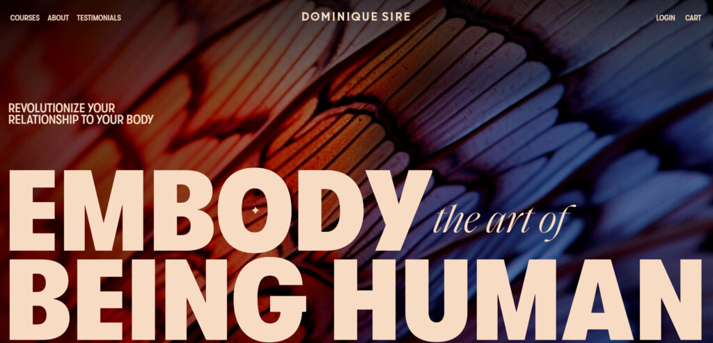
Oversized Typography
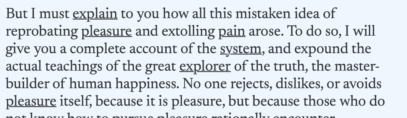
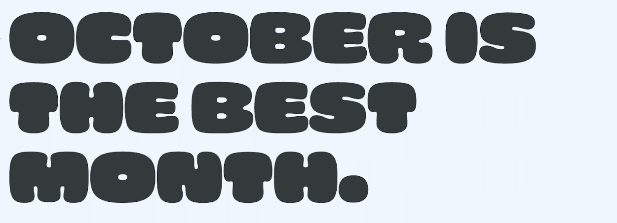
Might as well start with the biggest trend! Oversized font sizes have become more popular, but looking at 2024, you’re going to find it even more so. Whether the text is paired with images or simply standing alone, the text is oversized and bold with lots of contrast. Overall the trend is using sans-serif fonts and ultra-bold for headline fonts.
Text-Only Design: While some sites are image heavy, there is a beauty and a simplicity to text-only (or minimal-image) designs. They allow the user to focus on the message and are perfect for messages that need to get to the point quickly and effectively. For many, the lack of distractions is refreshing.
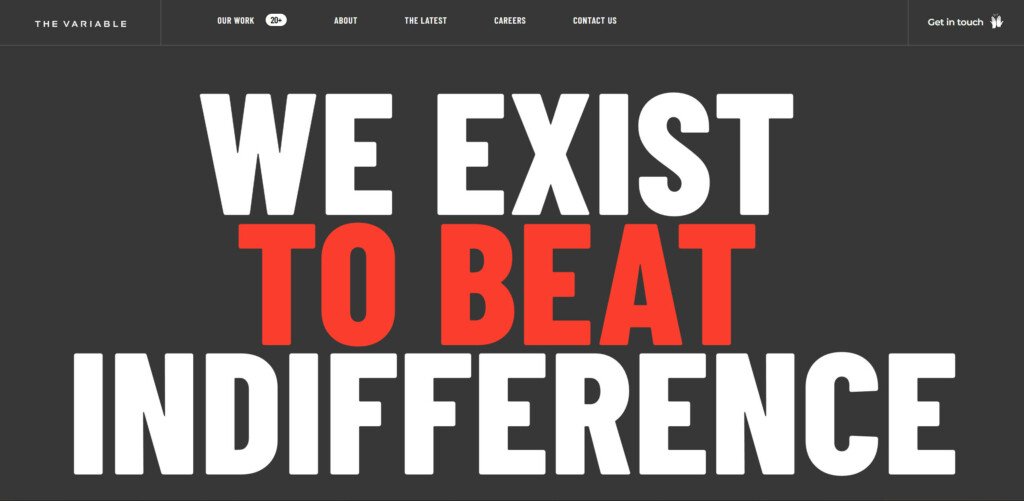
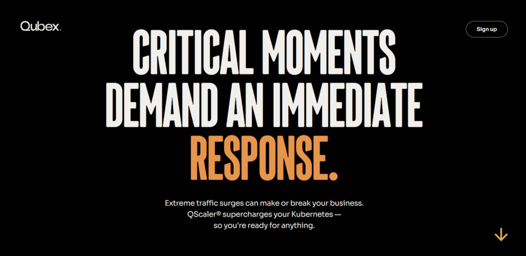
The trick to success is to LOVE your white space! (“Love her, leave her alone“). As well, understanding when, where and how to style the most important emphasis words is key to a flawless execution. Remember big text means mistakes are HIGHLY visible.
Bold Text Paired with Bold Images. Bring the WOW factor by pairing SUPER bold text with strong and moody imagery! This treatment really embodies the feel of a book cover or a movie poster. It really invites the user to engage with the site to find out more.

Animated Text
Movement on load/scroll: Text with motion on load adds a new level of user engagement. It gives them a feeling of truly interacting with more than just a static website. As with anything, it can be taken too far, but simple elegant movements can really give the site polish. Generally this type of animation is accomplished with HTML & CSS, which allows for the maximum compatibility with assistive devices. When adding this to your website, you should consider the readability impact on various consumer groups.
Fade-In Text
Wipe-in Text
Slide-Up Text on Scroll
The impact of text animation speed, repetition, complexity and flashing are all things that should be carefully considered. Movements that are too fast or feature non-stop animation can be too distracting. Animations that are too complex, or animate letter by letter may be hard to read. Flashing could cause headaches or seizures. In the end, the animation should add to – not take away from – the understanding and comprehension of your site.
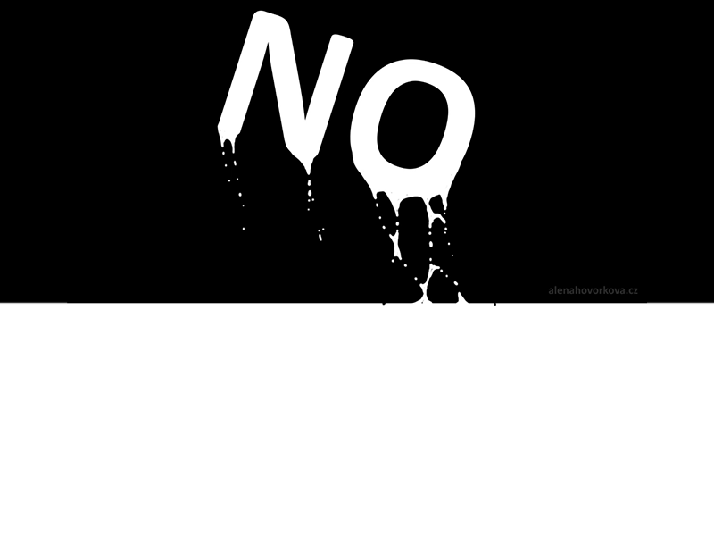
Too Complex
Non-stop Movement
Letter-by-letter Movement
Kinetic Typography: Although the definition of Kinetic Typography is simply “moving text” – this term is used to refer to a specific motion technique that integrates animation with text to express ideas. This effect is normally used most often in film and video applications, but with the web becoming a more interactive video-like space, this technique is transitioning over to webspace more and more. While this effect is very engaging and can be used to effectively enhance storytelling, it does pose a problem when it comes to those who are visually or cognitively impaired.
Kinetic typography is often created with programs like Adobe After Effects, and exported as gif image or video files which will need to have assistive information added. Even with adding alternate text or captions, it’s easy to see how people with visual impairment will have a lesser experience. Those who have cognitive issues may have a problem with the speed and/or flashing, and it could lessen their experience as well. That doesn’t mean that these graphics cannot be used, but this means that special attention should be paid to how the site will be experienced by users with differing abilities.
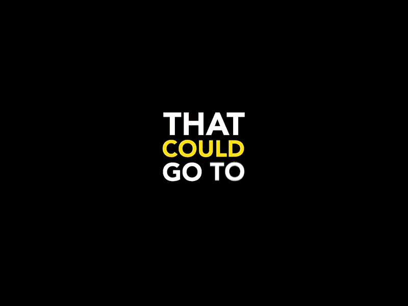
Interactive Fonts: Interactive fonts are exactly what they sound like. Standard fonts can be coded to change on user interaction such as: hover, click, etc. but will cause a content shift as seen below:

But multiplexed fonts allow the font to change its weight with minimal shifting to the surrounding content. Regular and bold weights can occupy the same amount of horizontal spacing, causing the transition to and from the hover effect to feel seamless.

To create these effects, the developer must code the bold using a variation setting – versus the traditional bold font settings. You can find more information on variable font coding at Mozilla developer resources.
Variable fonts can also do more than just a standard normal/bold shift. Multiplexing fonts can also have a variable italic axis and hover effect options that can create really fun little animated touches:
Source: Google Fonts, Multiplexed hover effects with more expressive variations, on a letter-by-letter basis.
Typeface: Cheee Variable.
An Important Note about Animated Fonts Animation is fun — BUT the motion can cause actual headaches, and other physical issues to some people. This can really harm your overall user experience. Whenever you’re adding animation you MUST ensure that your animation respects the users choice for reduced motion. Please also keep in mind that if your site is relying on the animation/motion to communicate an important message to the user, there are many people with disabilities who you will not get the chance to connect with.
In Conclusion: User-First Thinking Wins
These trends are fun, engaging and can really push the boundaries of what we can develop for our users. As much as we may long to incorporate these trendy features, we have to ensure our main priority is always on user experience for all. But as long as we incorporate them in a user-first design way, the site will be a success.
If you’d like us to help you make your site a success, give us a shout! Our studio of seasoned web professional designers and developers will take your site from concept, through to creation.
Hero photo by Octavian Dan on Unsplash