How we create the color scheme for your website

No matter how beautiful your color scheme is, if people can’t figure out how to navigate your website’s design, it won’t really matter.
Anyone can pick great colors that go together, guiding users through a new experience with those colors, that is art. Color may be a web designer’s most powerful tool in their belt.
Your main goal when picking colors should always be to increase the usability and accessibility of your web design. I’ve created a quick guide for creating color schemes that not only look good, but enable first-time users to understand your designs more easily.
1. Define your website’s purpose
We’ve all experienced what happens when features are added to a site without purpose…
The same goes for colors.
Would you start wireframing without first establishing the purpose? No. Then why would you start creating color schemes without knowing the purpose?
It’s easy to establish your design’s purpose by asking yourself three simple questions and writing the answers down (you’ll want to return to them later).
- What’s your key message?
- Why are you creating this design?
- How do you want your users to feel?
Take the answers to these questions as a rough framework for your website’s color selection process. Don’t sit around waiting for you brain to fill with a random inspiration of the perfect color scheme, that doesn’t pay well.
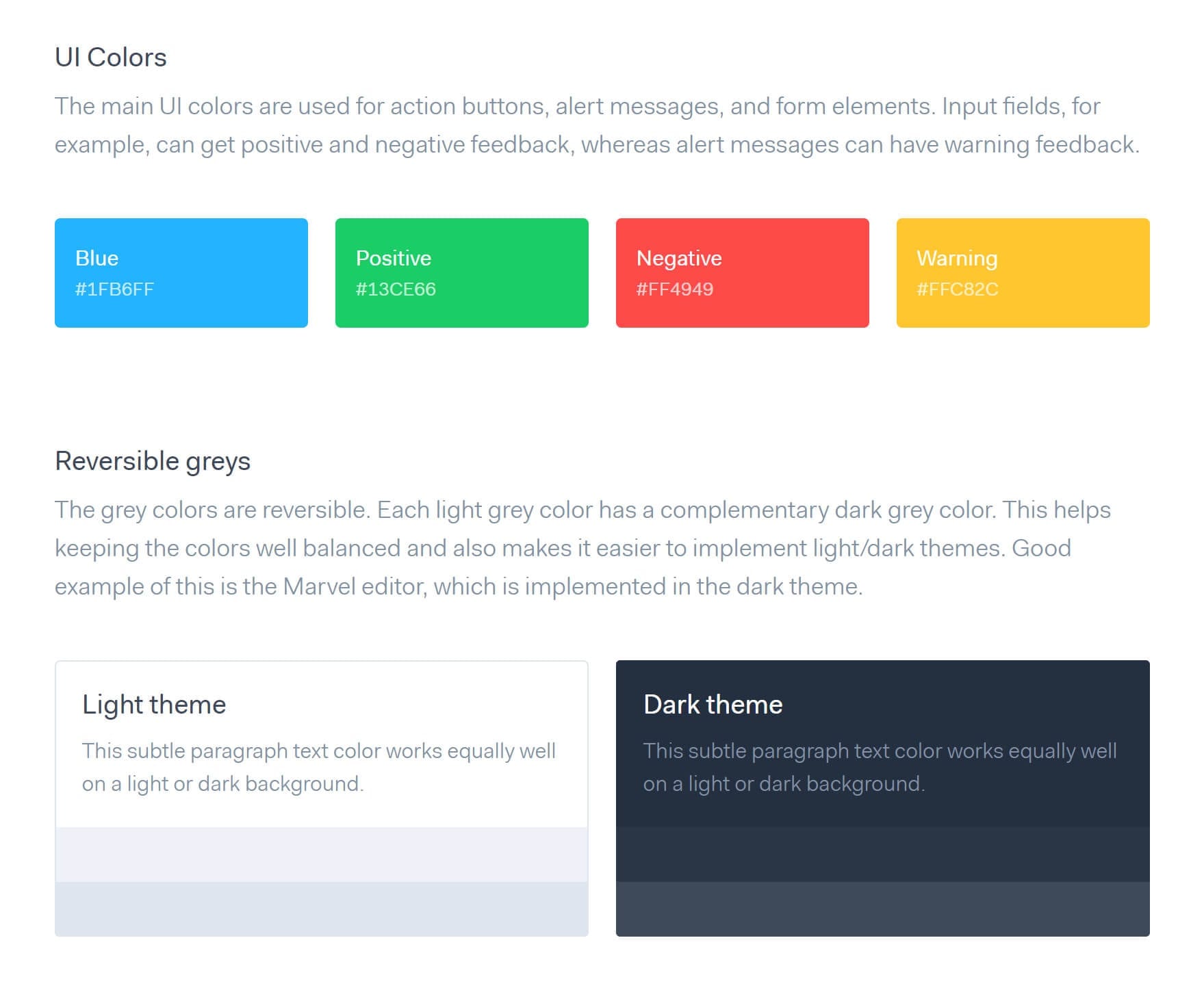
UI Colors
the main UI colors are used for action buttons, alert messages, and form elements, input fields, for example, can get positive and negative feedback, whereas alert messages can have warning feedback.
[blue button] Blue #1FB6FF
[green button] Positive #13CE66
[red button] Negative #FF4949
[yellow button] Warning #FC82C
Reversible Greys
The grey colors are reversible. Each light grey color has a complementary dark grey color. This helps keeping the colors well balanced and also makes it easier to implement light/dark themes. Good example of this is the Marvel editor, which is implemented in the dark theme.
Light theme
[grey text] This subtle paragraph text color works equally well on a light or dark background
[light grey background box]
[medium grey background box]
Dark theme
[dark grey box] This subtle paragraph text color works equally well on a light or dark background
[slightly lighter grey box]
[slightly lighter grey box]
Developing a system to create amazing color schemes is much more effective.
Congratulations, you’ve just completed the first of the four steps.
2. Identify your users
Color is almost considered a universal language.
We say almost.
Having worked with a variety of client in numerous locations, we quickly began to realize users respond differently to color schemes depending on where they are from.
No matter where you are on the globe many colors have a universal meaning, others can mean different things depending on culture and location. Because of this it is important to research the region and culture you are developing the color scheme for.
For example, the color green is almost globally accepted as a signal to proceed, success, a form of verification. Red, however, in North America is associated with error, failure, to stop, and passion. Yet in Japan, it is associated with the sun (“land of the rising sun”), happiness and joy, strength, self sacrifice, and passion.
They’re generally small differences, but a few colors or color combinations can create a completely different interpretation when designing for multiple regions.
3. Get inspired
I mentioned earlier that it is fruitless to wait around for inspiration to smack you in the forehead. You need to actively find design inspiration!
It’s actually pretty easy, if you’re looking in the right places.
At My Brother Darryl, we start by looking on Dribbble, Pinterest, WebGradients and Instagram, creating moodboards before starting any web design work.
We’re not always trying to reinvent the wheel when picking colors. We’re targeting to make the wheel as usable as possible.
We find by looking at other people’s work, we see which colors work well together and which ones do not. It helps us keep up on color trends in a specific industry and web design color trends in general, so we can make your site stand out.
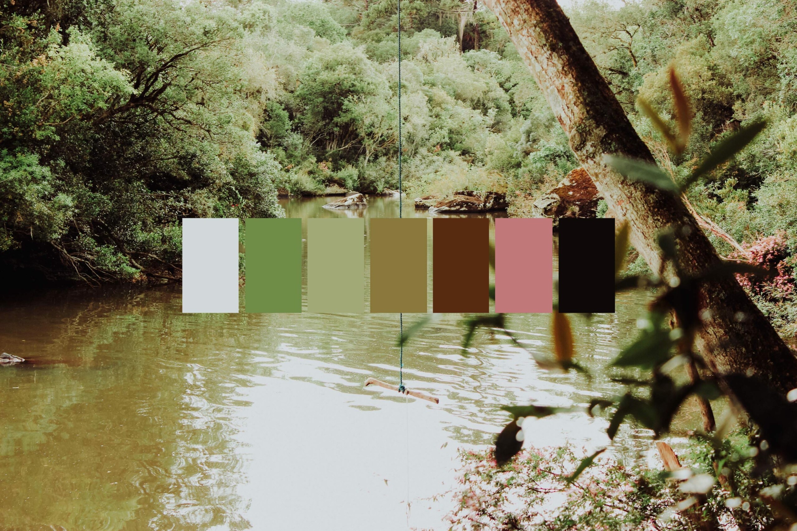
Don’t forget to step away from your monitor to find design inspiration. Get out and look at the architecture around you, visit art museums, and best of all spend time with nature to get inspired. Arguably these are the best ways to create a unique color scheme.
4. Pick your website color scheme
Creating a dynamic color scheme is easier once you’ve established the basic foundation for your website’s design.
Start with picking your basic typefaces, button designs, navigation bars, and start applying your color scheme. Your end interfaces and products may end up being different, but you’ll get started more quickly with these basic assets.
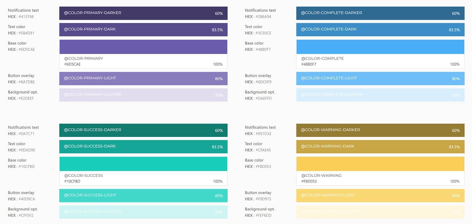
For most web design projects, you’ll need to pick colors for the:
- Primary accent color
- Secondary accent color
- Background color
- Error color
- Success color
The primary accent of your web design should be fairly easy, it’s normally the brand’s most identifiable color. Remember this when choosing the rest of your color scheme.
When deciding on the call to actions (CTAs), success and error states, clarity is more important than the actual color. We work to keep a clear contrast between the CTAs and different button states.
Fun fact: green doesn’t have to be your go-to success color.
Play around and have a good time, just don’t pick colors that make your interface hard to navigate.
Sometimes the best website designs are the ones that buck all current trends and disrupt their industry, this includes color schemes. If you have a minute, check out Polar Asset Management Partners.
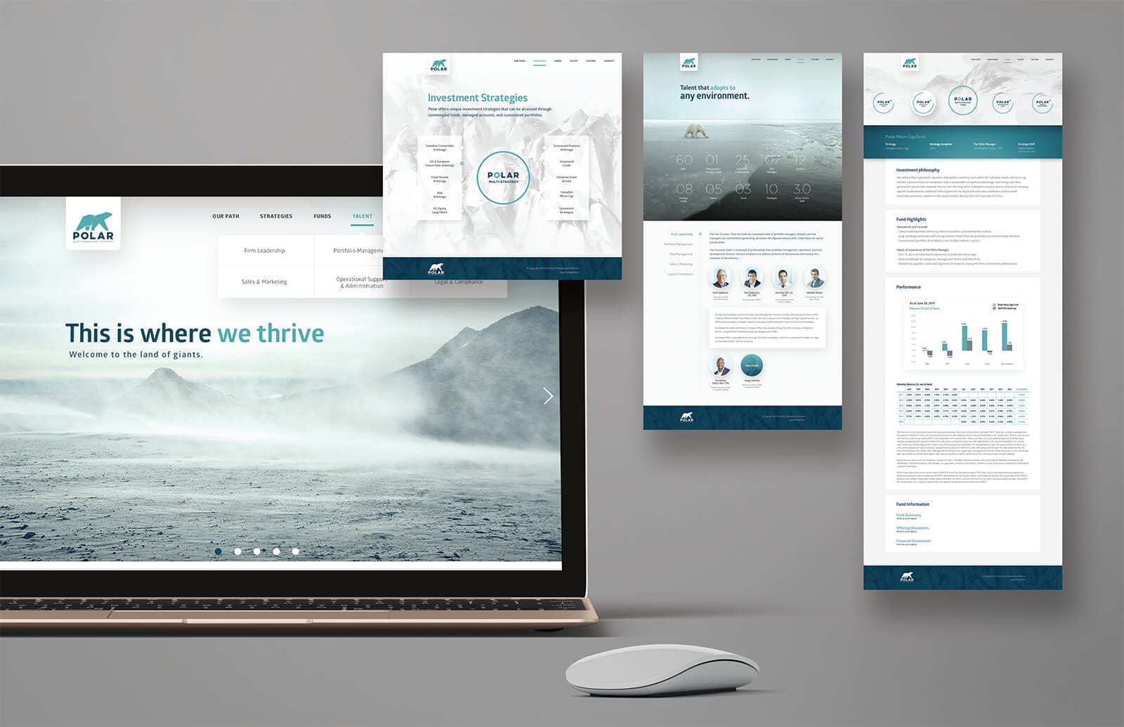

They’ve gained international recognition for disrupting the hedge fund asset management genre by stepping outside the norm with a unique color scheme and clean arctic design.
With just three colors used almost through the entire interface, Polar relies on this color scheme to communicate key messages while users interact with the site.
That’s really the main component of any successful color scheme. Most people can easily pair colors that look great together, picking colors that guide users through a new interface is design at a different level.