Neumorphism: What it is, and Isn’t

What if websites felt like a clean 3D immersive experience? With buttons and depth that made you feel like you were working with a real tangible interface? Well, there is a trend that is pushing the 2D web design boundaries of what we see on websites and in apps.
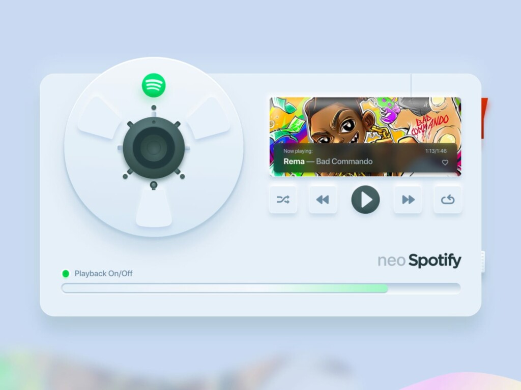
Source: Dribbble
Neumorphism – also known as “New Skeuomorphism” has become a popular web design trend in Instagram and Dribbble website design samples. But what is it? When should it be used – and does it meet accessibility guidelines?
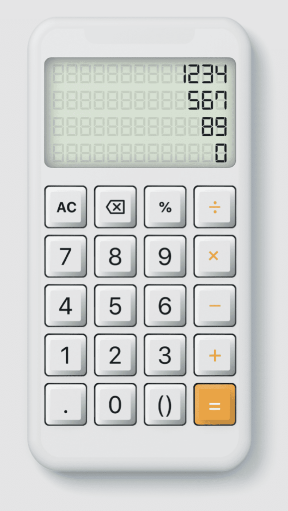
Source: Dribbble
Source: Behance
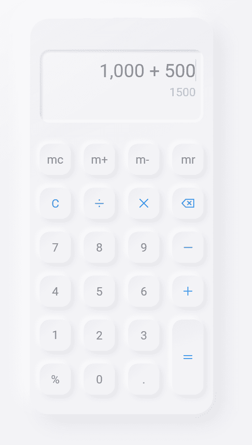
Source: Dribbble
Let’s start with what Neumorphism is — and what it isn’t.
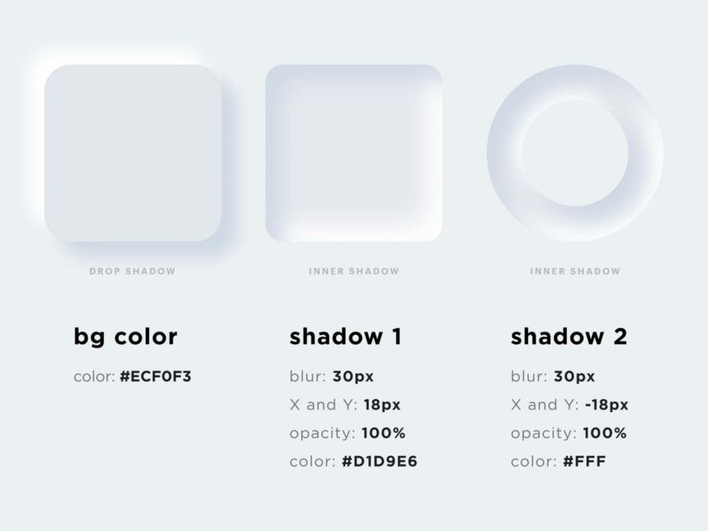
Neumorphism is a technique used to make flat lifeless items look like they’re extruding from the background. It should not look like it’s floating on top of the background – but rather a shape that is a part of the background – much like moulded plastic. In this designers are trying to bring real 3D realism of objects to flat digital design. But unlike Skeuomorphic design – which is hyper-realistic – Neumorphism elements are stripped down to the bare minimum.
The way this is achieved is by using the same coloured shape as the background and then using 2 different shadows – a light shadow and a dark shadow to create subtle depth. In this, it creates a very soft clean sleek interface.
As the user clicks an interactive item, the shadows might change to make it look inverse or inset. This gives the user a real tactile feel as if the site were in actual fact a 3D interface.
Pretty cool eh? Well not so fast….
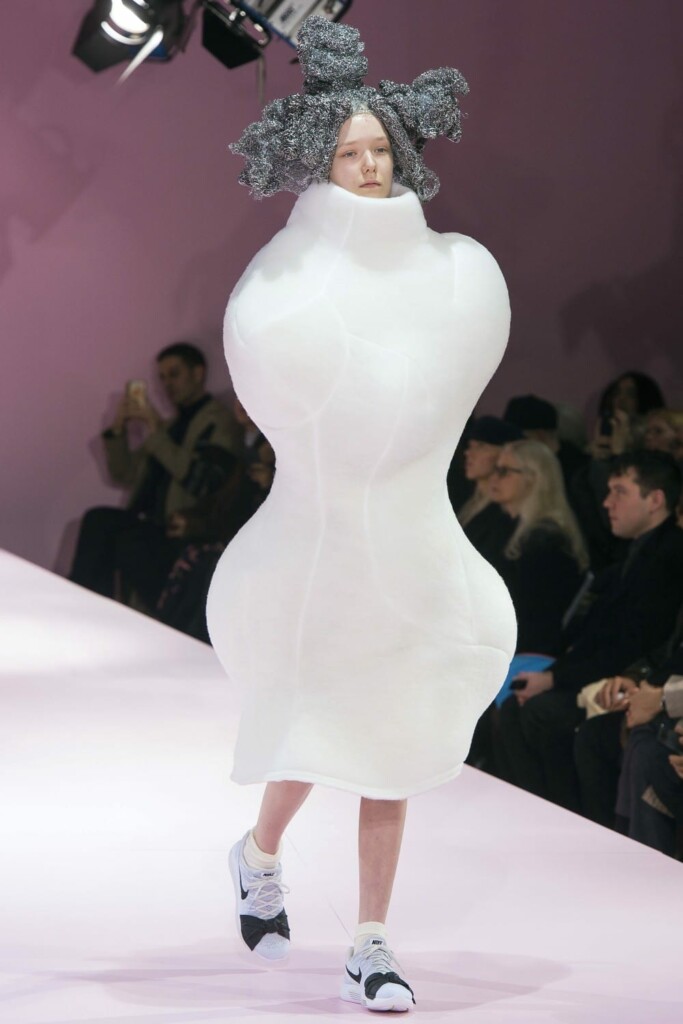
Unfortunately, not all trends are functional when it comes to real-world applications. There are some inherent problems with this. Honestly, it’s kind of like the dresses that you see on a high-fashion catwalk. Absolutely stunning art pieces… but not practical for daily wear.
Visibility
While sleek and minimalistic it’s VERY hard to see – even for a person with perfect vision. Think about using this on your phone, outside, or in various types of lighting. Would you see the buttons? I know I wouldn’t! Yikes! That’s not even taking into account the thousands of people with various types of visual issues. With that in mind, this trend quickly becomes pretty unattractive.
“We all love the ‘pretty’ but we also need to remember for it to be usable by everyone.”
Michal Malewicz
CAN we make it accessible?
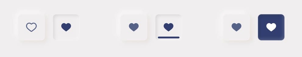
If you’re using this type of design it’s imperative that anything that is interactive or integral to the site’s information has enough contrast. For example, if you’re using this style with a button – you should ensure that the text or icon on the button has enough contrast that it’s easily seen, or as shown below if there are multiple highly contrasted states. BUT the question is can it be identified as a button – in any of its states, on all devices, in various lighting conditions and/or by a person with less-than-perfect vision?
“Elements that trigger changes should be sufficiently distinct to be clearly distinguishable from non-actionable elements”
W3.org
The answer is no.
It’s going to be impossible to say inclusively that everyone will be able to use UI designed in this style. If that makes you say “Meh, that doesn’t bother me” – then I hope you’re also ok with losing out on a very significant number of potential clients! Remember, a leading reason for abandoning a site is frustration. We should be looking into any and all reasons to AVOID user frustration, instead of creating them. The public is looking for an easy-to-use, simple-to-navigate site – that quickly serves up what they’re looking for. Unfortunately, this design style could force the user to spend a lot more time trying to figure things out.
Because the Neumorphism style negatively affects users from both visually impaired persons to mobile device users, this style gets a big thumbs down. Can you use touches of this design style? Absolutely! You can use this style on elements that do not impact usability – but you need to be very intentional to ensure that it’s done right.
Want to know how your site measures up to accessibility standards? Contact us today to find out how we can help you! [email protected]