Website Color Trends for 2024

Vibrant, bold, and color combinations with tons of contrast are what 2024 web design is all about! Design next year is all about getting attention and causing a little drama! (Electric blue, neon pink, vibrant yellows) Don’t fret if you need something a little softer though. There’s also soft earth tones, punctuated with bold colors like jet blacks, dark greens and vibrant oranges and reds. Here are some of our favorite website color trends for the upcoming year.
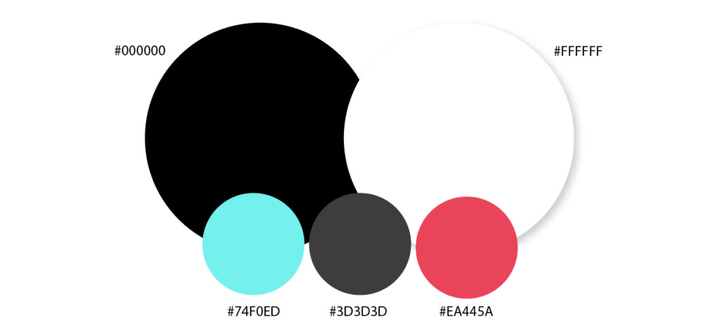
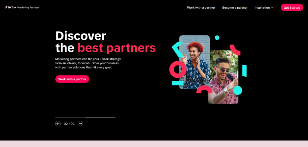
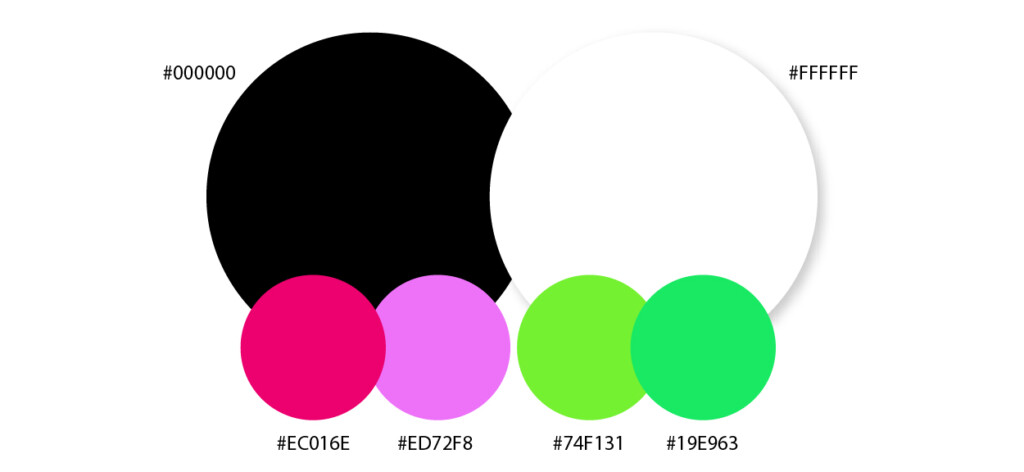
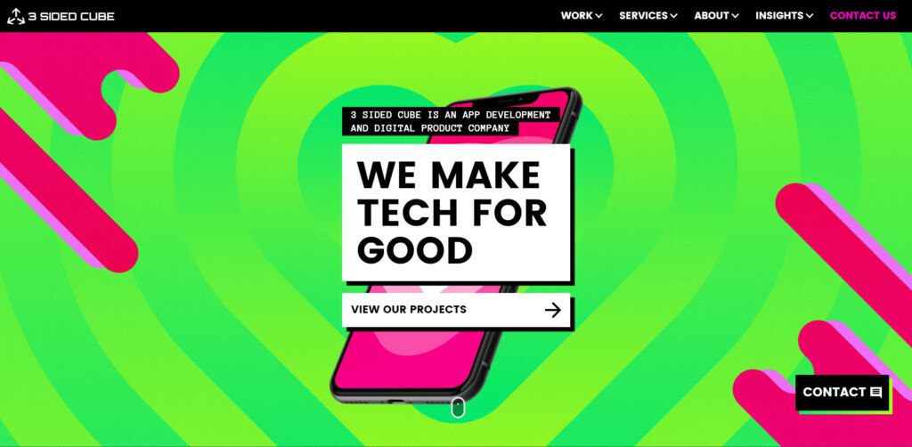
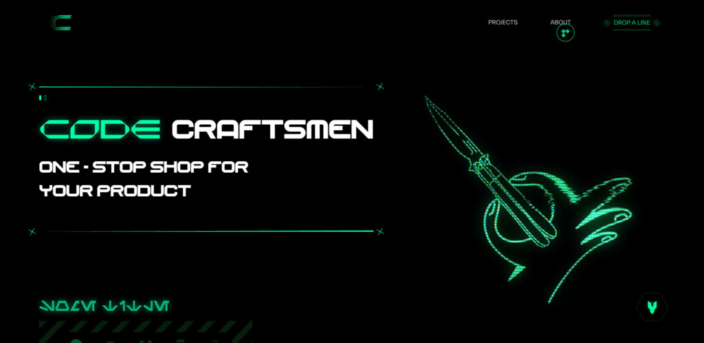
Black & White
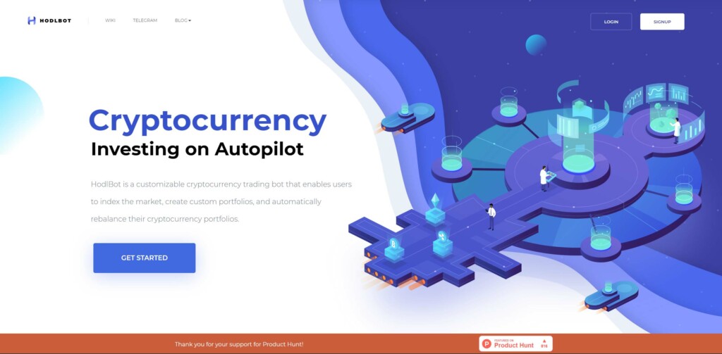
Clean, simple and easy to read. Black and white punctuated with bright vibrant color touches is absolutely on trend. It pairs perfectly with the current trend of large bold text treatments. Dark backgrounds are ever increasing in popularity as they have been shown to reduce eye fatigue & save battery life.
We love the way the bright colors sit on the black! We feel it really represents the dramatic and fun energy of the TikTok brand. Remember that you don’t have to use the black background everywhere! Swap that out for a soft background color to accentuate a separate area, but keep the text bold and highly contrasted to keep the trend throughout.
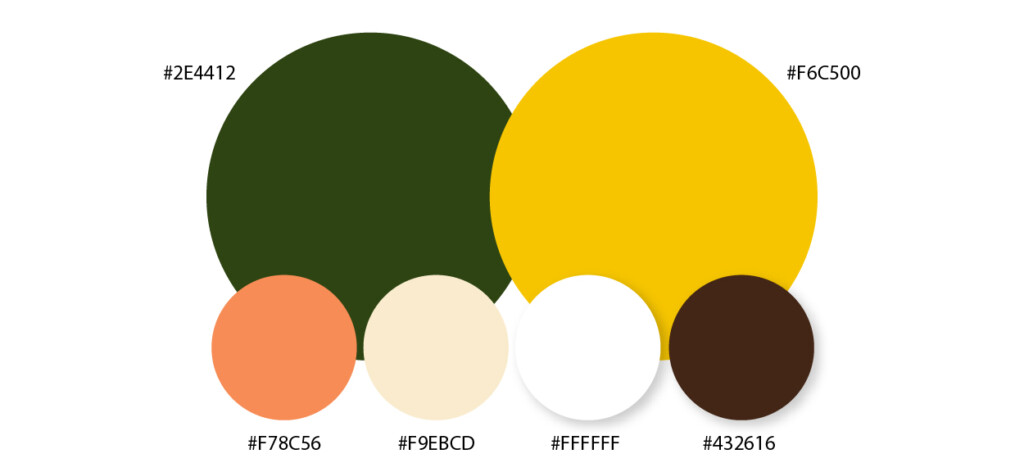
Boldly Earthy
Environmental colors don’t have to be soft and sweet. Instead of light and airy colors, try creating serious drama with dark earth tones! Accentuate your messages with bright pops of yellow, green and orange. This palette also works quite well with the Pantone 2024 Color of the year Apricot Crush.
The right treatment of these colors can be extremely sophisticated and luxurious while still giving off an inspired-by-nature feel. Throw in more shades of bright green to get a more fresh spring-like feel. While adding more oranges and shades of brown will inspire an organic fall feel.
80’s Craze
Pull out your florescent windbreaker, tease your hair and throw on another layer of hair spray – the 80’s are back baby! This decade wasn’t called the ‘Decade of Decadence‘ for no reason! This style is all about over-the-top boldness, confidence, crazy luxury and even gaudiness! In retail stores and film, we’re seeing more fashion and characters from the iconic 80’s ‘pop’ back up – which is a huge influence on web design trends. Don’t forget to add abstract patterns and irregular shapes to help pull the look together. But you don’t have to go full 80’s “mullet, shoulder pads & boombox”, you can use these retro colors and design touches to bring a little excess into the 20th century.
The main thing to be cautious of with this particular trend is how it will affect colorblind or visually impaired users. Remember to ensure that your text is always paired with background colors that give it enough contrast to be highly readable.
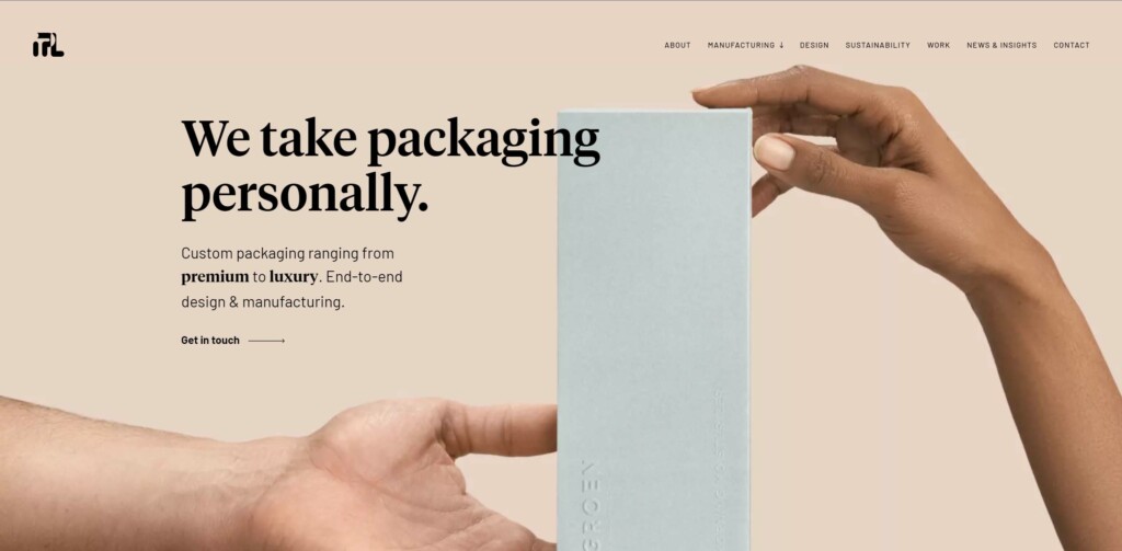
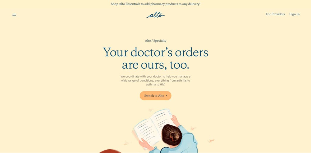
Pastels are not Passé
While we’ve focused on mostly bold colors, pastels are still being used, but in more of a supporting role. As 2024 keeps accessibility in higher priority than ever before, pastels move to the background, while bold colors take precedence for the sake of readability.
Three pastel color combos that are trending are:
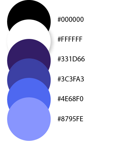
White & Blue
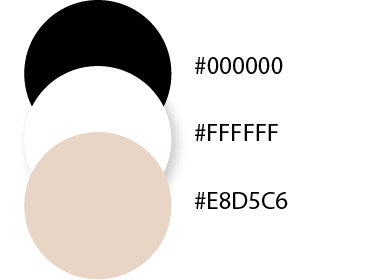
Beige & Dark Grey/Back
Orange & Blue
And Finally Complex Gradients
Gradients are back but in a slightly different way. These are gradients that are adding depth and movement to an otherwise boring static page. In the case of Marble the background gradient has texture and moves as though it is a real item blowing in the wind. For those who have problems with motion or attention issues, the speed of the animation or the motion itself could be an issue, but this is a very creative and unique gradient treatment nonetheless.

In the case of Stripe, they are also using an animated color gradient treatment that runs through quite a few smooth and bold color changes. The speed is much slower and it’s less likely to cause a distraction, but it is best to follow WCAG accessibility rules and have these animations stop for those with the reduced motion setting.

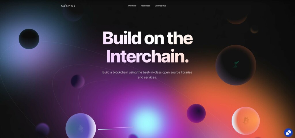
Cosmos has created an amazing example of how you can use complex gradients to create depth without the distraction of motion. The stunning gradient design actually creates an illusion of movement without any actual motion.

Conclusion
As for all color trends, the developer and designer need to work closely together to ensure that no matter what treatment is used, UX and accessibility is retained. There is no point in creating an amazing website if your users have issues using it! If you’re struggling with any areas of development – from User Experience, to Accessibility, to planning or testing – contact My Brother Darryl for more information on how we can help support you.
Hero Photo by Pete Godfrey on Unsplash